Properly arranged and designed content affects the perception of complexity.
Comprehensibility of content
We all tried to read the instructions on how to use the oven sometimes. Or some other kitchen device imported from the countries of the Far East.
Technical language is usually very repulsive. Arrangement of content is confusing and suddenly we ask ourselves if we are reading instructions for a kitchen device or a plane. The most persistent people read the instructions for 2 or 3 minutes.
Unfortunately, it is often the same with communication materials that we create. Even if they are not written in a strictly technical language, they are still incomprehensible for users.
Investment in trust and decision-making process
 And that is how we often spend a lot of time and money. Preparing something that does not achieve its purpose. We produce only costs and possibly even reduce consumer trust in our brand. Because perceptual fluency effects on our judgement of truth. If the text is badly arranged and unreadable, users do not trust the source.
On the contrary, consumers tend to trust the source significantly more in cases where the content is fluent. The composition and the form of content affect the perception of complexity. Knowledge of phrases, placement of punctuation marks and the design in general gives us the sense of effort that must be invested in understanding the content. And if it is difficult to understand, it is difficult to buy.
Therefore, readability of content is a segment of our work to which we pay special attention. Especially in mobile websites and applications where trust is even more important and decision-making process shorter.
Readability in mobile application

We were facing a similar challenge during the development of our mobile application ARTOUR. From the beginning it was pleasant to look at. At least while we were testing it in a comfortable office chair.
But when we used the application while walking, it all became ackward. The lines were jumping and overflowing. Just reading a few sentances made our eyes really tired.
The content was practically unreadable. Especially when it was not prepared by us. Consequently, a big part of the application functionality was lost.
Improving readability
 During further development of the application we have devoted a lot of attention to the readability of content. We tested different solutions, searching for the most suitable:
- font,
- thickness of the font,
- font size,
- spacing,
- alignment,
- distance from the edge of the screen.
And almost everything was right. But it did not feel right. Something was still unpleasant about long texts, even if they were really interesting.
Use of the slider
It was not easy to find the right solution. Especially because we were still thinking in terms of desktop browsers and websites. We were observing the static situation on the computer screen.
But it is different on mobile devices. Users hold them in hand and slide with their thumb on the screen. Naturally. A move that has already become subconscious and part of our muscle memory.
The division of content
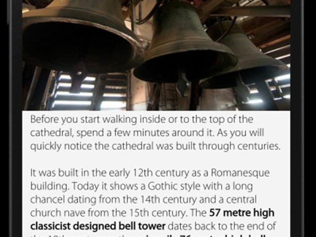
 Therefore, we could afford to divide the content more. Paragraphs can be separated, because users simply slide the screen and the height of the screen can be arbitrary. And when we separated the individual paragraphs and placed them on different layers, the "oh yeah moment" happened.
The moment when we realized, that the content was finally readable. Arranged exactly as we wanted. For mobile use.
Placement of paragraphs on separate layers was the detail that improved the performance.